3554690
Description
Note by Mariane Castro, updated more than 1 year ago
|
|
Created by Mariane Castro
about 10 years ago
|
|
Page 1
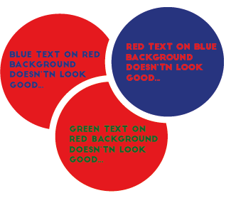
Sometimes we look at a printed or projected page and the colors may look funny. One color may jump while the other seems recessed. This effect is called chromostereopsis, and stronger with red and blue, although it can happen with other colors like red and green. This color combination can be hard and tiring to read or look at. The best solution is to avoid it.
Notes to remember: Avoid putting red and blue near each other on a layout or screen. Avoid blue or green text in a red background, ou red or green text in a blue background.
Want to create your own Notes for free with GoConqr? Learn more.